Services
Hotel Website Planning
UX & UI Design
Hotel Website Development
SynXis Integration
Content Migration
date
2024
Knights Inn is an American value hotel chain that provides budget-conscious guests with all the travel essentials they need for a convenient, simple, and smart stay.
VISIT KNIGHTS INN WEBSITE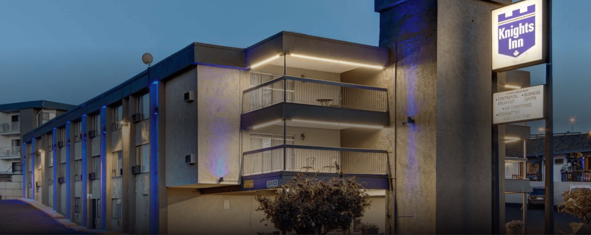
Project Description
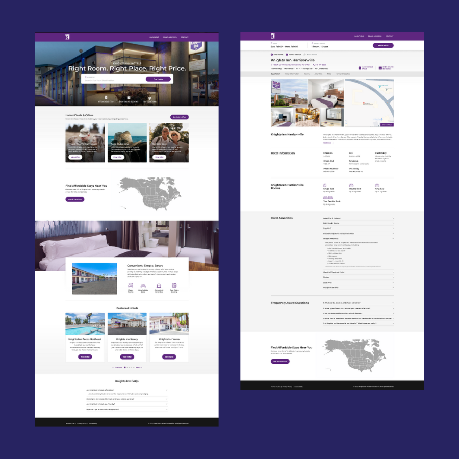
We were tasked with creating an entirely new and intuitive hotel website for the Knights Inn brand which had previously lived on its parent brand’s website.
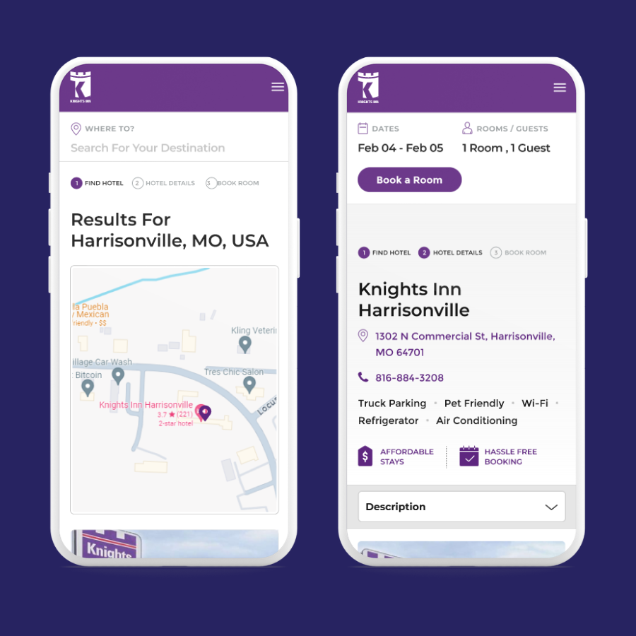
The new digital experience was intended for guests looking to book accommodation on the go, so the website had to be clean, simple, and super mobile-friendly.
The purpose of the website is to increase the Knights Inn hotels’ visibility and bookings by optimizing it for marketing campaigns and engagement.
The project included planning, design, development, and/or implementation of:
- Hotel search flow
- Content migration from RedLion.com (150+ hotel pages)
- Redirect adjustments
- Brand theme applied to SynXis booking engine
Challenges
- Short deadline. We had only 6 weeks for this end-to-end custom website design project, including migrating over 150 hotel pages over from their old ‘digital home’.
- Booking journey. Bookings happen on a third-party platform, so we had to come up with a user flow that would make the hotel search and booking processes easy and seamless.
- Limited messaging opportunities, especially about pricing. Because of the limited integration options with the third-party booking platform, we could not display room rates, nor could we approximate them due to dynamic pricing. This was flagged as a concern as the website was meant to serve a price-sensitive audience.
- Migrating large volumes of content. We had to migrate over 160 hotel pages from an entirely different CMS which, if handled manually, would have taken weeks (and, remember, we had 6 weeks total for the entire project!).
Solutions
1. Measure Twice, Cut Once (a.k.a Research & Planning)
To minimize risks and prevent delays, we dedicated time to research, competitor and user analysis, and thorough website planning that considered any possible disruptors to the project.
We also scheduled weekly client meetings to expedite materials collection and approvals — some of the most common roadblocks in custom web design projects.
2. Streamlining Search & Booking User Paths
Most of our audiences were identified as budget-conscious guests looking for convenient roadside lodging. They usually have short booking windows and tend to book accommodation on the go, which meant that searching by location would be the most convenient functionality for them.
We implemented both an auto-fill search bar and an interactive map with all property locations to facilitate the search process. The search bar allows searches by hotel name, city, and even address.
Search results pages clearly outline the booking steps and highlight each property’s location and amenities.
Once they reach the hotel page, users can select the date range and proceed to the booking platform.
We also focused on using clear language and outlining the booking process, so the user understands their next step and the entire search and booking flow.
3. Communicating Affordability without Rates
As we lacked pricing information and social proof, we developed badge-like icons that reassure users they would enjoy budget-friendly rates and direct, hassle-free online bookings.
4. Migrating Large Volumes of Content
We optimized the hotel page design to match the content fields closely to the existing pages and we identified trusted plug-ins that allowed us to automate the content migration and minimize manual content management work.
Results
We delivered this end-to-end, custom web design project on time and without complications.
In just 6 weeks, Knights Inn hotels have received a streamlined, intuitive, and mobile-friendly user experience, and a clean and on-brand UI design.
Digital Spice, on the other hand, has gained another happy client. 🙂
-
Certo! Restaurant Web Design Upgrade case study
How we upgraded Certo! WordPress website in less than a month
view case study
-
Sonesta Newsroom Website Redesign case study
How Sonesta Newsroom said goodbye to poor UX and content management struggles in just a month
view case study
-
Academy for Little Children Web Design Upgrade case study
How we created an intuitive & playful digital experience for the Academy for Little Children
view case study
-
Sonesta Franchise Web Design case study
See how we designed a custom WordPress website for Sonesta Franchise
view case study
-
Denver Selfie Museum Web Design case study
How we created a fun and engaging website for this interactive museum
view case study


