Services
Website Planning
UX & UI Refresh
Web Development
SEO
date
2023
Certo! is an authentic Italian restaurant in Washington D.C. located in The Royal Sonesta Washington DC Dupont Circle hotel.
Visit Certo!'s WebsiteProject Description
Certo! is an authentic Italian restaurant in Washington D.C. They turned to us to drive more website visitors via search engines (SEO).
To achieve this goal, we need to enhance the website’s user experience (UX) and CMS to improve engagement and enable admins to scale the website easily. And so, our web design upgrade story begins.
The Challenge
A full website redesign was not in Certo! budget. Aware of the power of UX and its impact on SEO, the restaurant allocated a limited budget and set a 1-month turnaround goal for website upgrades.
Let’s take a look at the website before and after the upgrade:
The Solution
With limited resources, we focused on website planning, maximizing the existing assets, and introducing the elements that are most likely to move the needle.
1. Measure Twice, Cut Once: Meticulous Web Design Planning
Our goal was clear: Enhance the UX, empower admins to manage and scale the website easily, and do it all in less than a month. We had little to no room for costly do-overs, so planning the website meticulously, from UX to development, was cardinal.
- We began by assessing our existing resources, from website capabilities to content, to understand what we can retain, upgrade, or discard for maximum impact.
- Next, we defined our audiences and how they would interact with the website, taking note of the information they need and user journeys they would take to decide whether to visit Certo!
- Keyword research and competitor analysis helped us vet our assumptions about user expectations, as well as complete the list of must-have website content and features.
- Finally, we explored the admin experience of the website to create a list of necessary CMS upgrades, from page creation and editing functionality to plugins and integrations.
With research-based insights, we mapped the updated user journeys and created a detailed action plan to:
- Enhance the website’s conversion funnel
- Optimize key landing pages for search engines
- Enhance the website’s technical environment
2. Upcycle & Optimize: User-Centric, Goal-Driven Website Design
Our designers focused on repurposing as many website elements as possible, introducing only essential modules that would move the needle on the site’s performance.
We enhanced the existing modules to make them easier to use and navigate. Check out the Gallery module makeover:
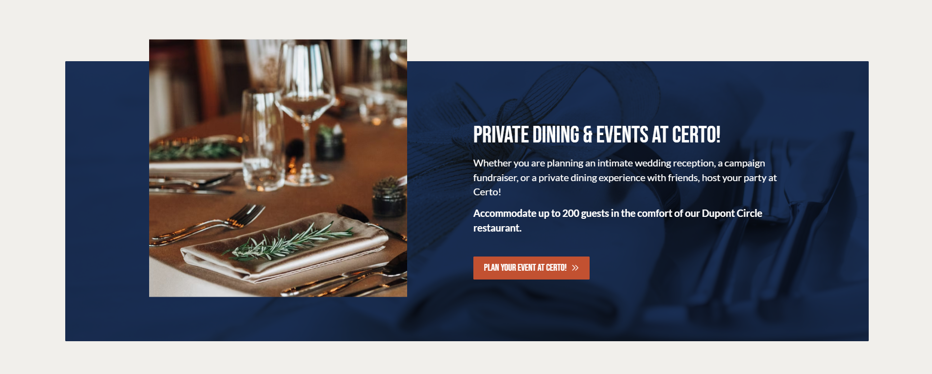
We added new modules to spotlight the restaurant’s services such as event and private dining to attract new audience segments (e.g. corporate) and generate leads.
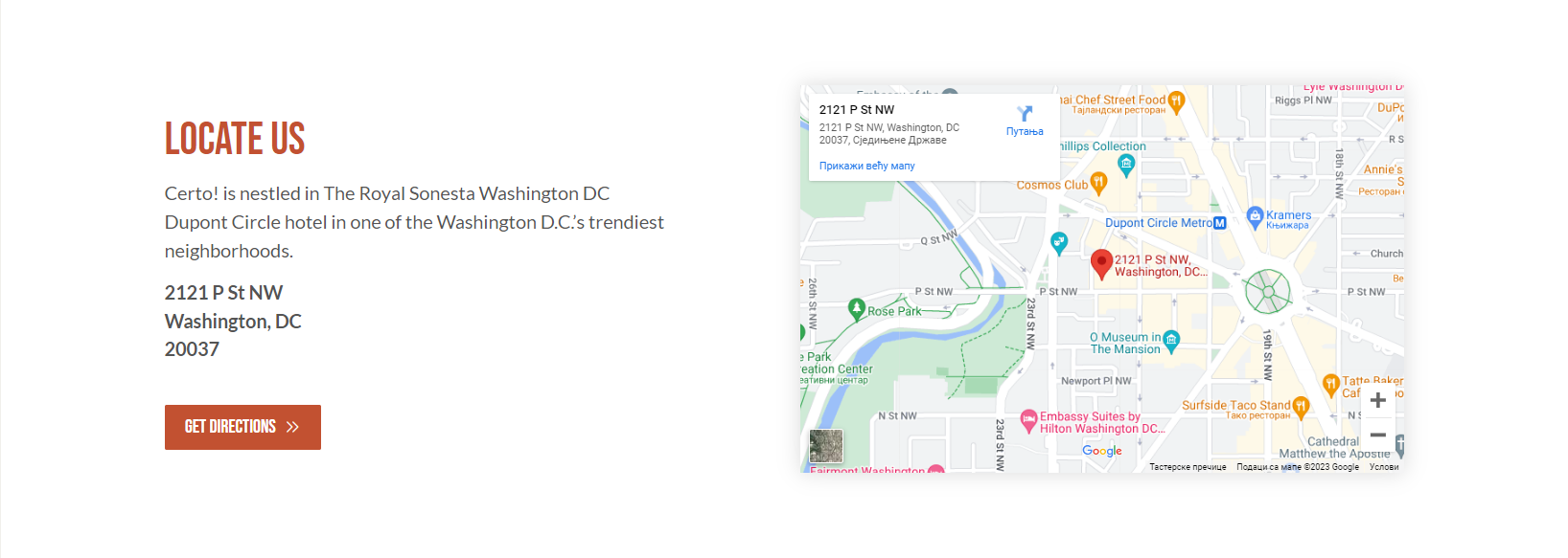
We introduced the FAQ module and Google integrations to make it easier for prospective guests to plan their visit.
3. Developing a User-, Admin- & SEO-Friendly Experience
On the development front, we upgraded both the backend and frontend environments to turn this website into an effective marketing tool.
We revamped the CMS, making it user-friendly for the restaurant’s team and allowing them to update content with ease, whether it is introducing new offers or producing new pages to capture marketing opportunities.
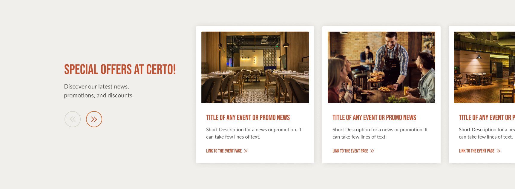
The addition of industry-standard plugins such as Yoast SEO paved the way for effective search engine optimization and further improved the website’s usability.
On the frontend side, we restructured the content with a clear header hierarchy, making it readable for both users and search engines, and consistent in styling across pages.
The website is fully responsive and provides a seamless experience across devices.
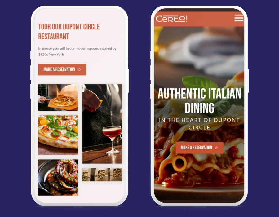
Launch & Learn
With careful planning and a commitment to preserving as much of the existing website as possible, we delivered an upgraded user experience on time and on budget.
Not only does the website provide a refreshed UX and UI, but it is also incredibly intuitive and easy to update, empowering the restaurant to seize new marketing opportunities as they arise.
The website is now a live and fully optimized marketing tool, ready to attract, engage, and convert prospective patrons.
As with any web design project, be it a complete redesign or minor upgrades, the launch is just a milestone. We will continue to measure and optimize Certo! website as we gather data and user feedback.
Looking to upgrade your website? Request a free proposal.
-
Knights Inn Hotel Website Design case study
How we delivered a brand new website for an American value hotel chain
view case study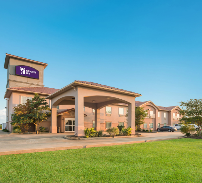
-
Sonesta Newsroom Website Redesign case study
How Sonesta Newsroom said goodbye to poor UX and content management struggles in just a month
view case study
-
Denver Selfie Museum Web Design case study
How we created a fun and engaging website for this interactive museum
view case study
-
Sonesta Franchise Web Design case study
See how we designed a custom WordPress website for Sonesta Franchise
view case study