Services
Website Planning
UX & UI Refresh
Web Development
SEO
date
2023
The Academy for Little Children provides high-quality responsive care and a learning environment for children between the ages of 5 and 12.
Visit The Academy's WebsiteAbout the Academy for Little Children
The Academy for Little Children provides high-quality responsive care and a learning environment for children between the ages of 5 and 12. With centers in Lincoln and West Warwick, RI, the academy focuses on children’s cognitive, socioemotional and physical growth in order to promote an integrated and effective approach to learning.
The Project
After more than 30 years in business, the Academy for Little Children embarked on a journey to revitalize its online presence by reinvigorating its brand and online positioning.
The primary goals for website redesign included:
- Effectively communicating expertise to build confidence among parents of prospective students
- Providing an appealing experience to prospective students
- Creating a user-friendly experience with an intuitive CMS and UX for both parents and website administrators.
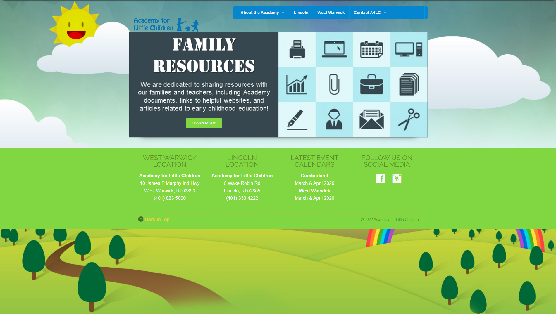
Check out Academy for Little Children’s digital experience before the redesign:

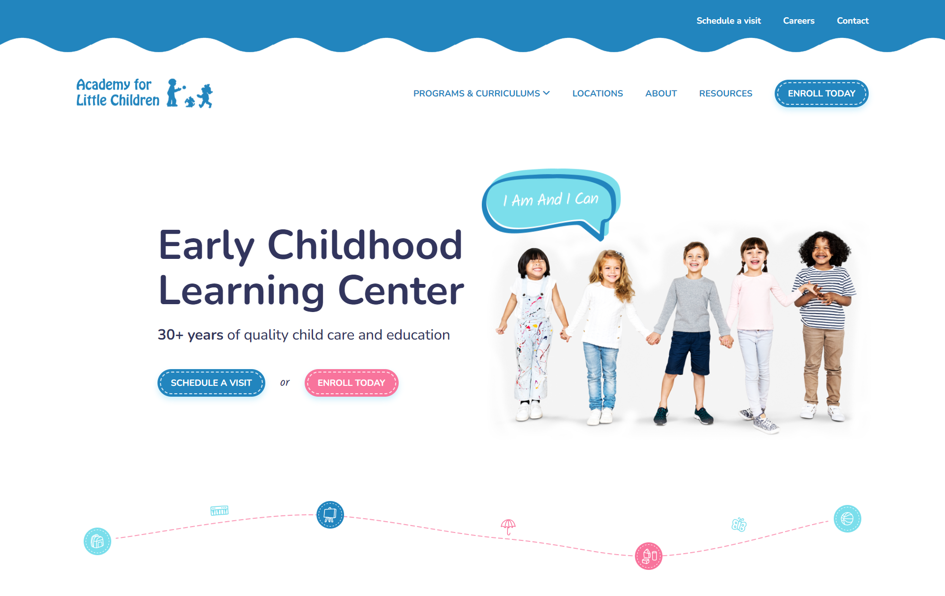
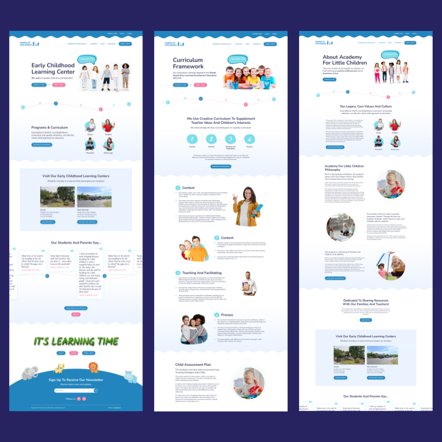
And here’s the Academy’s digital experience after our redesign:

Pretty stark difference, right?
The Challenge
The Academy for Little Children needed a simple informational website, but repackaging decades of history and expertise into a seamless user journey came with its own challenges.
Our redesigned experience needed to address two distinct audience segments – parents and prospective students – while operating within a limited budget and timeframe.
The Solution
To address the challenges, we devised a website strategy that included:
- A thorough content audit and client interviews to understand buyer journeys and translate them into user journeys, while retaining the little gems such as the brands “I am and I can” tagline
- Website’s sitemap reorganization to help parents navigate the content intuitively and find information specific to their child’s age group easily
- Competitor analysis to collect industry insights and create a unique experience
The website strategy underpinned our messaging, as well as the design and development phases.
UX & UI Design
Competitor analysis informed our strategic UX and UI decisions, with a focus on retaining existing content while reformatting it for faster absorption. As a result, the website now presents a more intuitive sitemap where each page delivers focused information to a specific audience segment, making the site and Academy for Little Children’s offering easier to explore.
We used clear and visible call to action (CTA) buttons in combination with a clean and sticky menu to further streamline user journeys and help parents navigate the website.
On the UI design side, we decided to use a monochromatic color palette, coupled with playful imagery, to differentiate the brand from competitors who are mostly using complimentary color schemes.

Development
In the development phase, we continued to employ industry best practices, ensuring ADA compliance, proper header structure, and optimization for performance and search engines.
We tailored the WordPress CMS to the Academy’s needs, providing an intuitive experience for administrators to edit and create pages hassle-free.
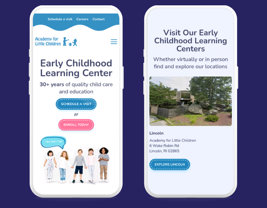
The Academy for Little Children’s website is accessible, fully responsive, and search engine friendly.

Launch & Learn
The Academy for Little Children now has a refreshed brand identity and online presence.
With strategic planning, proactive project management, and implementation of web design and development best practices, we have managed to transform the Academy’s digital presence into a user-and admin-friendly experience.
Website content managers can now easily edit and produce new pages to leverage emerging marketing opportunities, while parents can gather the information, they need to make informed decisions about their child’s education and enrollment at the Academy.
At Digital Spice, we view website launches as milestones rather than goals on the website (re)design journey. As brands collect user behavior and website performance insights, we recommend evolving and optimizing the digital experience to maximize its potential.
Ready for a website redesign? Request a free proposal.
-
Certo! Restaurant Web Design Upgrade case study
How we upgraded Certo! WordPress website in less than a month
view case study
-
Denver Selfie Museum Web Design case study
How we created a fun and engaging website for this interactive museum
view case study
-
Sonesta Newsroom Website Redesign case study
How Sonesta Newsroom said goodbye to poor UX and content management struggles in just a month
view case study
-
Sonesta Franchise Web Design case study
See how we designed a custom WordPress website for Sonesta Franchise
view case study


